Optimized Checkout Flow
HUBBLE CONTACTS
CHALLENGE: Create a checkout flow for Hubble Contacts that is optimized for conversions.
ROLE: Research, ideation, design, prototyping, QA
TOOLS: Sketch, Invision, Flinto
TIMEFRAME: June 2017 - Ongoing

Hubble is a subscription box company that delivers affordable daily contact lenses to your door.
Background
Ampush only controlled some of the steps of the Hubble flow: the steps are: (landing page, filling out contact lens prescription) then users initiate checkout by getting sent to Shopifys checkout flow where they fill out their shipping and payment information.
Problem
We were seeing significant drop off (over 50%) from users from the initiate checkout step to purchase, which made us believe that there had to be some opportunity for checkout optimization.
Solution
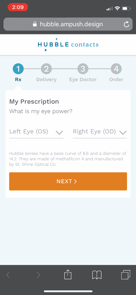
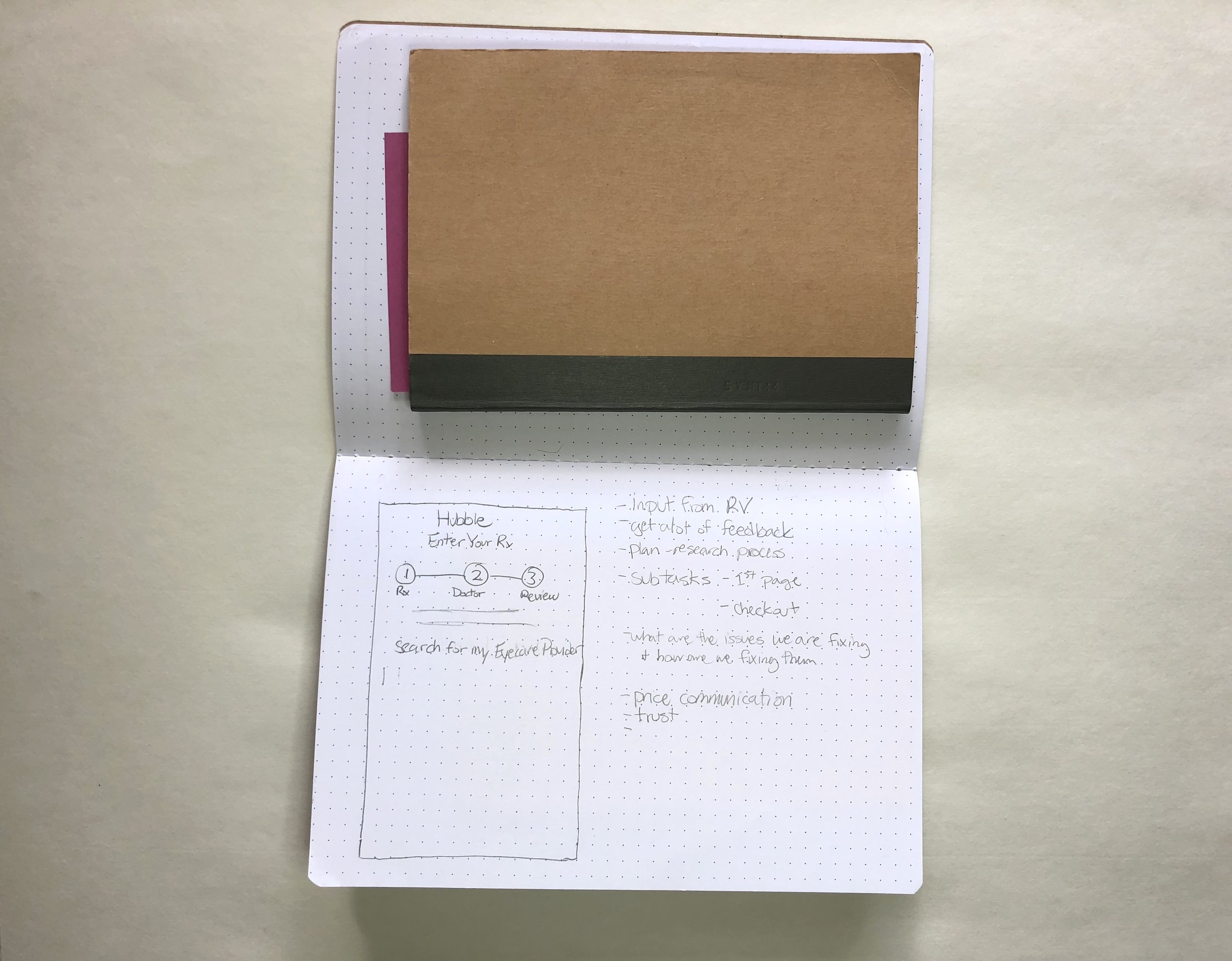
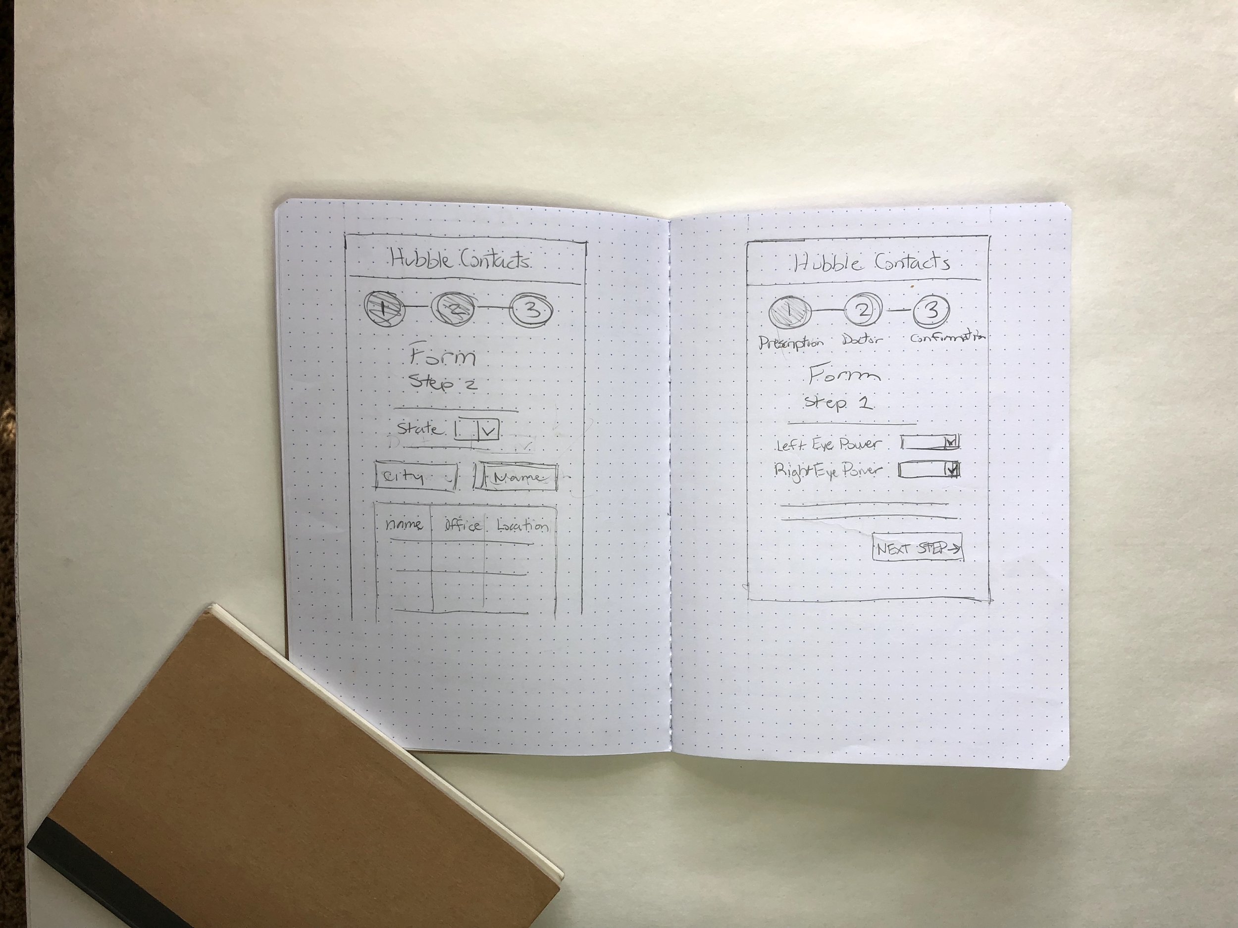
Our solution was to build a cohesive, multistep checkout flow that combines prescription, doctor information, shipping and purchase information.
OLD CHECKOUT FLOW DESIGN PAIN POINTS

1) Creating an account at this step in the flow creates a lot of friction - users are typically resistant to giving away their email due to fear of getting spammed.
2) The "First Name" and "Last Name" form fields can be reduced to just 1
3) Optional form fields just add intimidation to the user
4) Phone form field is not required to checkout

5) Blue checkmark makes it seem like user has already completed this portion
6) There are no discount codes for Hubble - this allows for user to hesitate and increase the chances of bouncing
7) The user is brought to the shopify checkout page that does not look anything like the Hubble page - this can be jarring to the user and disruptions a cohesive experience.
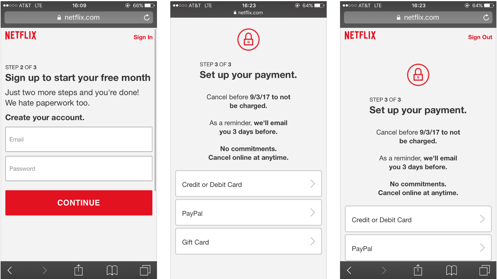
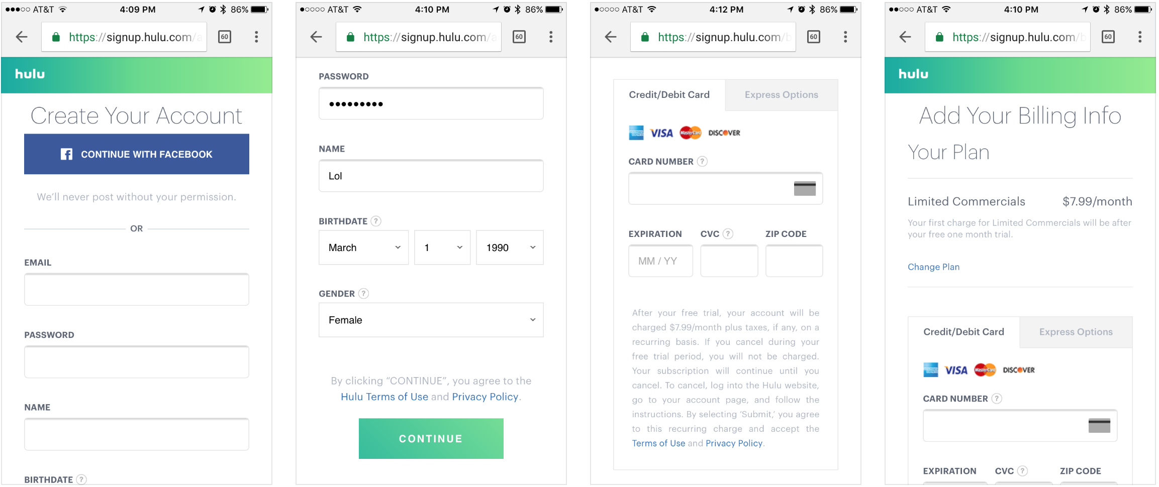
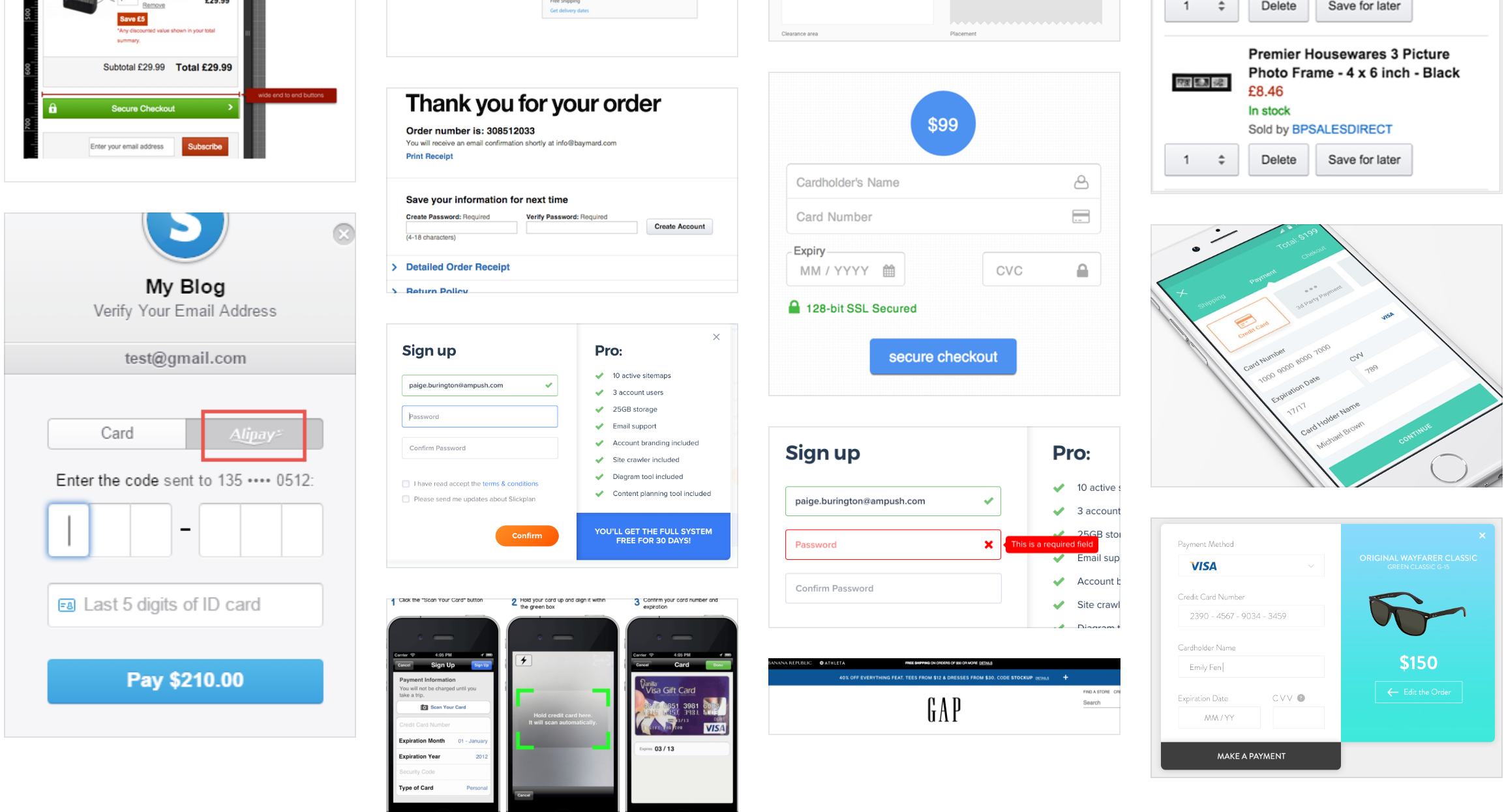
COMPETITIVE ANALYSIS
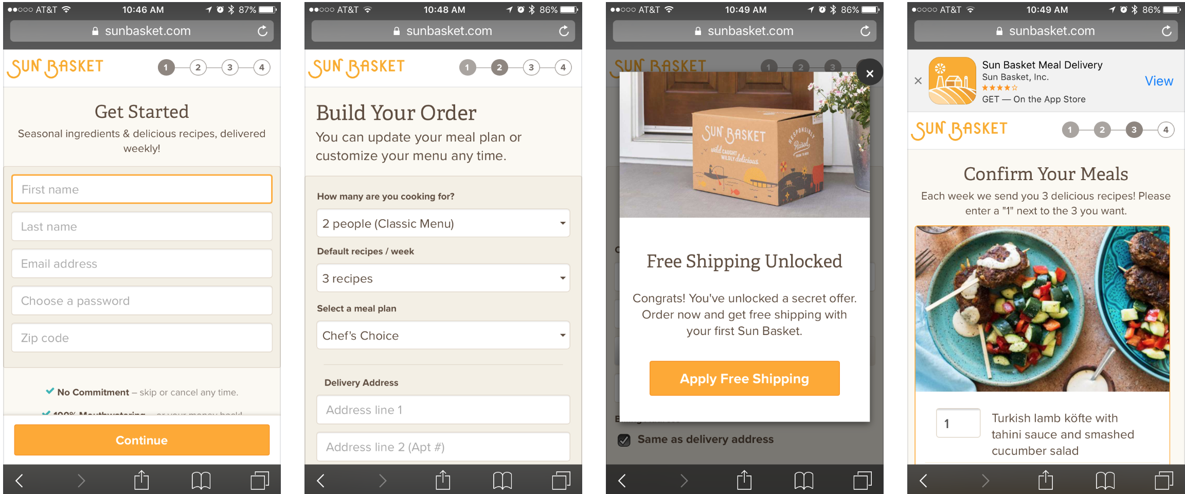
I looked at different checkout flows for several different companies (particularly ones with subscription services):
- Le Tote
- Sight Box
- Birch Box
- Trunk Club
- Netflix
- Honest Company
- Hulu
- Graze
- 1800 Contacts
- ebay
- Hotel Tonight
- Uber Eats
UI Research
WIREFRAMES
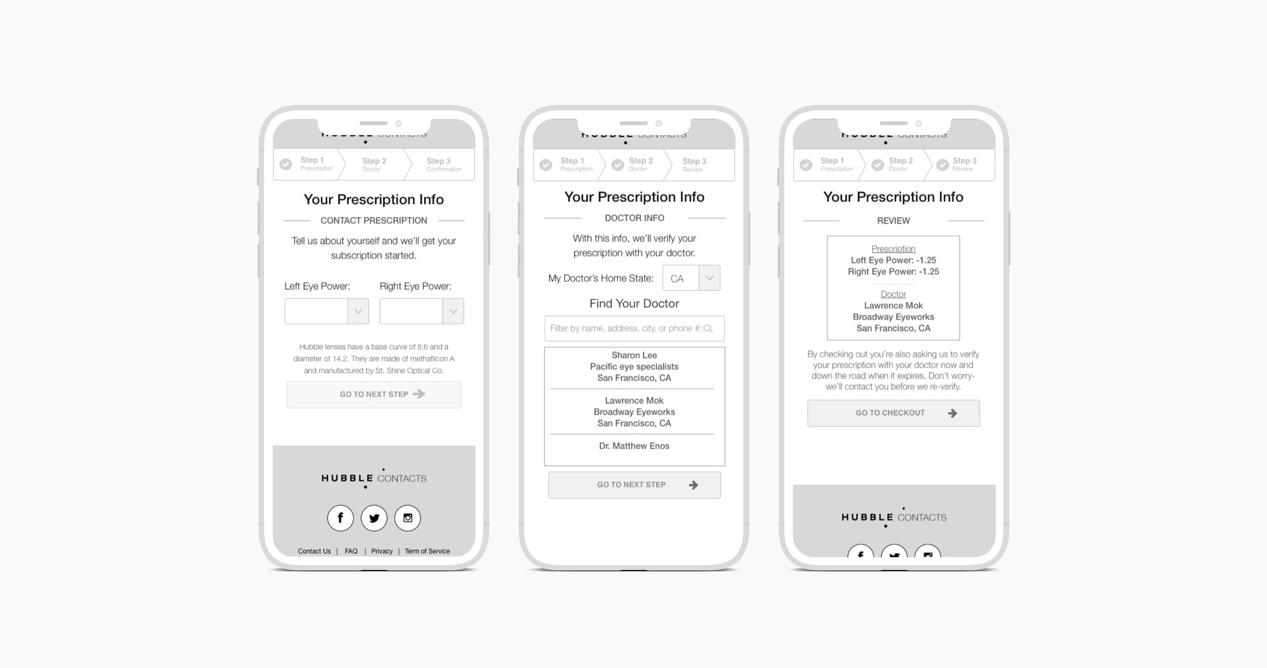
UX Optimizations:
- Show larger product image throughout checkout, with free box
- Add clear progress bar, and a multi-step flow
- Hide `Address Line #2` field, rarely used
- Have a single CTA throughout checkout (Hubble has 3!)
- Error validation messages should point to the exact fields that need edits
- Remove phone # field (it’s optional today)
- Re-design form labels and the form interaction
- Implement other payment methods: PayPal, Apple Pay, Android Pay
- Ability to “scan credit card” (out-of-the-box plugin for this)
- Add security and trust symbols on the checkout page
- Add expected ship date
- Ask for Zipcode first, then auto-fill city and state
- Implement Auto-advance multi-step credit card input form
- Remove “promo code” box on checkout (this incentives users to google for promo codes)
User Interface - Version 1
Full Story - Rage Clicks
Hypothesis - Users think that they can edit the "base curve" and "diameter" because of the way they are designed.
Variant Iteration - I took these elements out and we have seen a reduction in drop-off at this step.
Mouseflow - Click Heatmaps


Hypothesis - Drop-off is occurring due to the attention ratio being too high (users are clicking header and footer logos).
Variant Iteration - Removed footer completely and removed link from header logo.