
Optimized Landing Page
HUBBLE CONTACTS
CHALLENGE: Create a landing page for Hubble Contacts that is optimized for conversions.
ROLE: Research, Ideation, Design, Prototyping, User Testing, QA
TOOLS: Sketch, Photoshop, Illustrator, Invision
TIMEFRAME: June 2017 - Sep. 2017 (3 Months)

Hubble is a subscription box company that delivers affordable daily contact lenses to your door.
PROBLEM & HYPOTHESIS
We realized that there was significant drop-off between the landing page and the first step in the checkout flow (only about 19%). Our hypothesis was that if we could increase the number of visitors getting through the beginning of the funnel, conversion rates would increase.
SOLUTION
Our solution to this problem was to optimize the user experience, user interface, and copy to be more DR focused.


Research
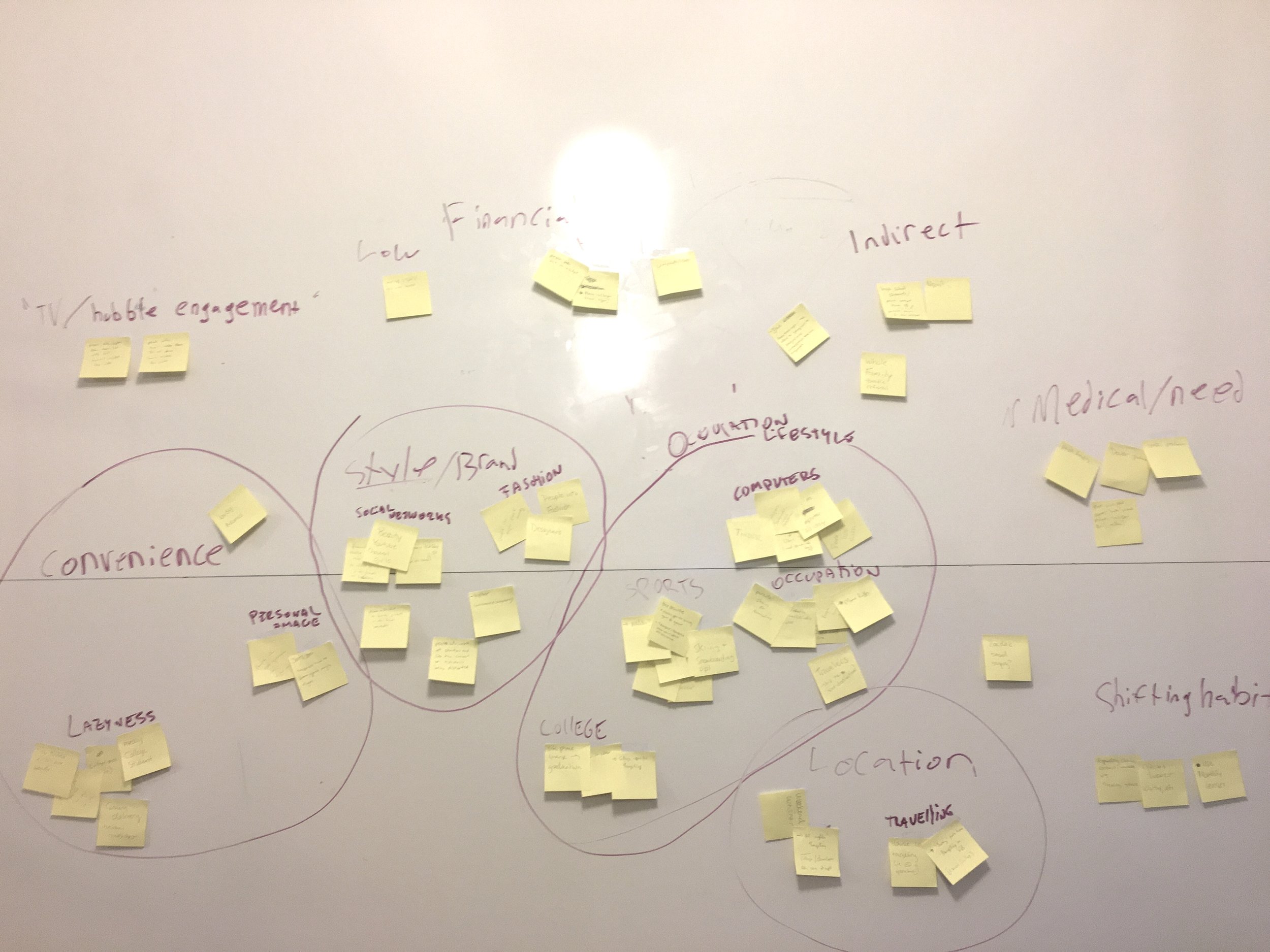
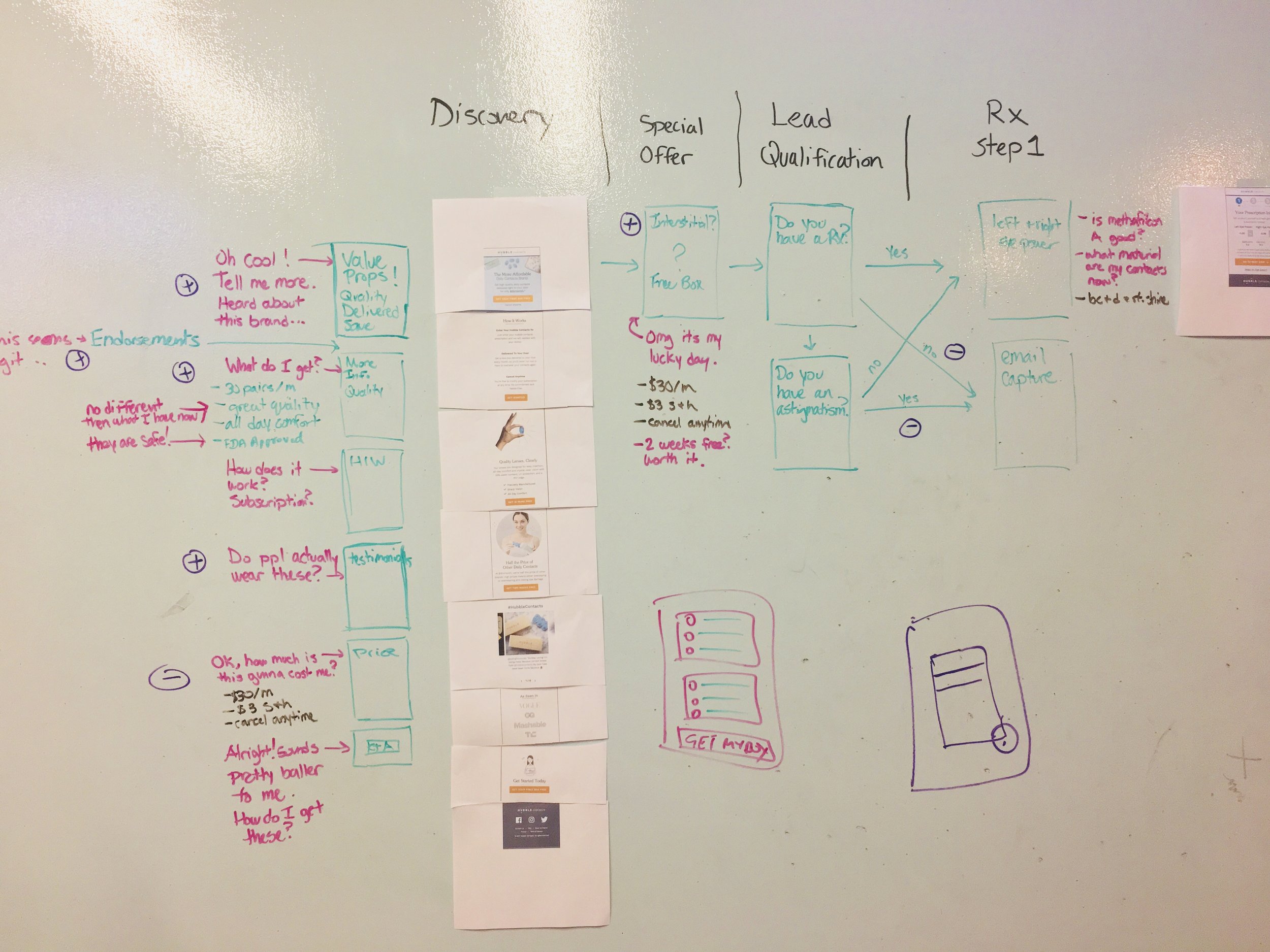
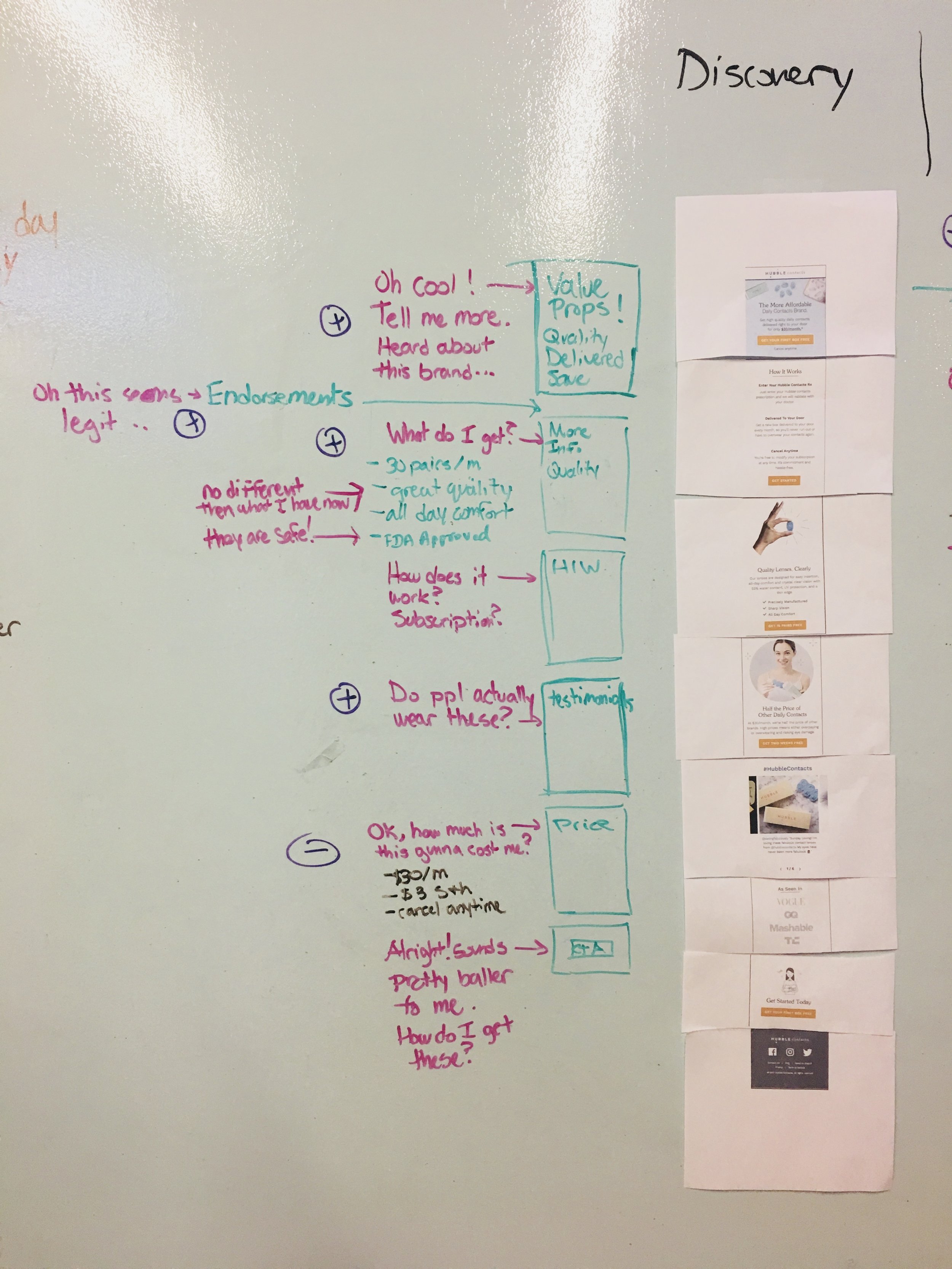
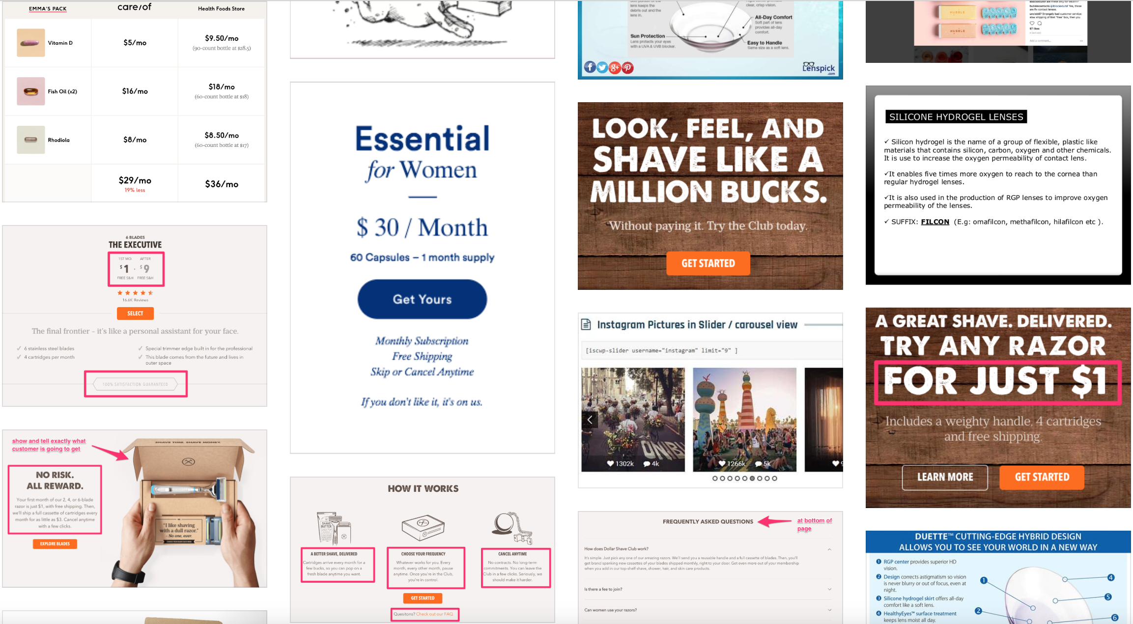
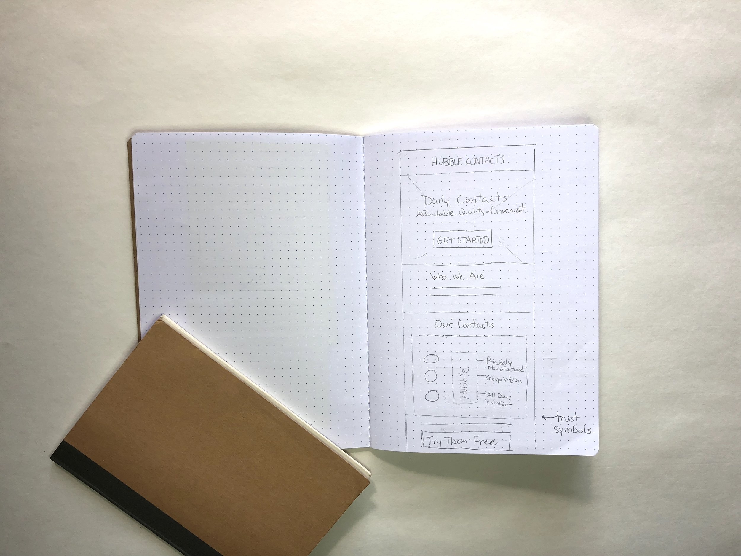
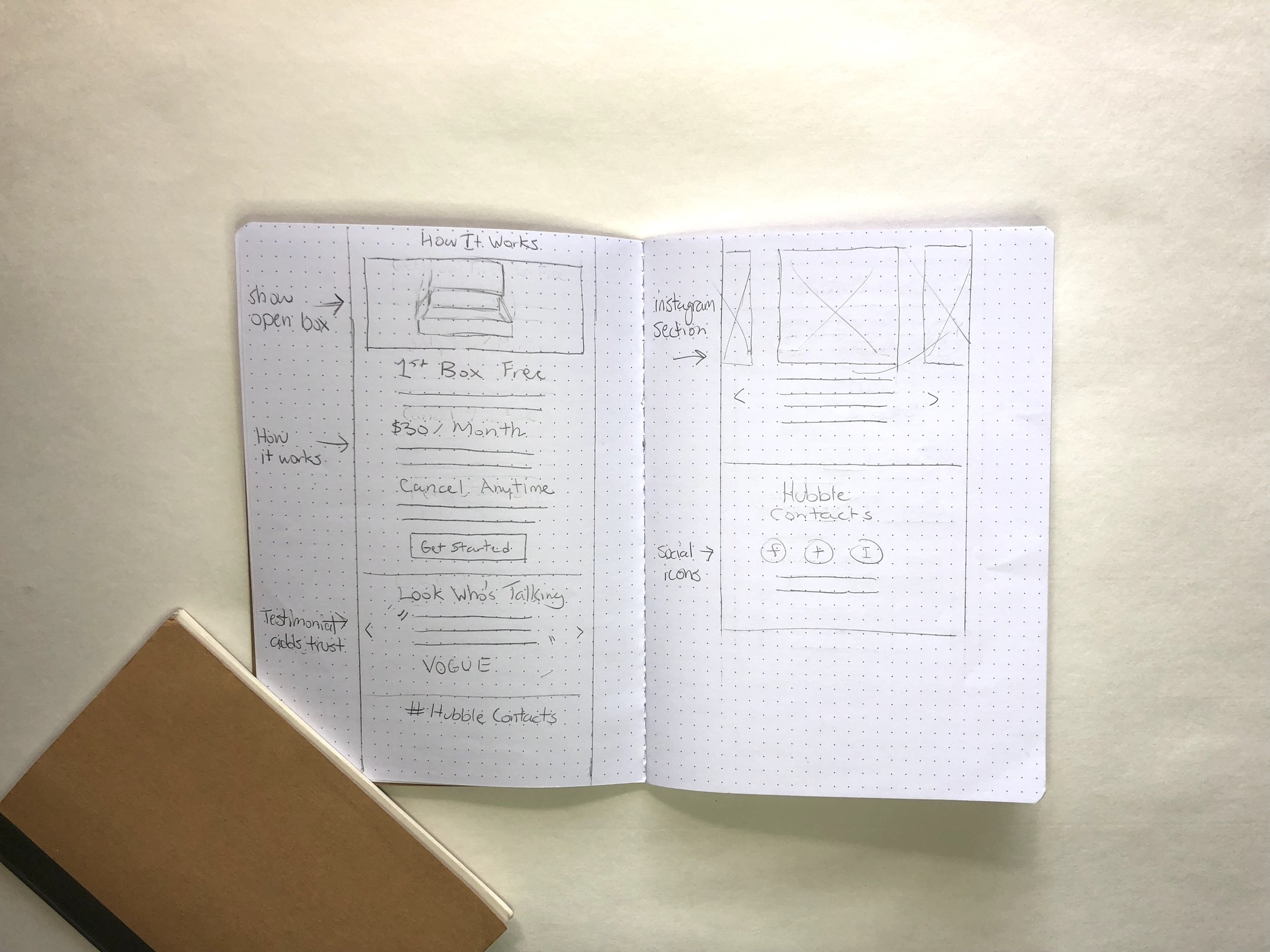
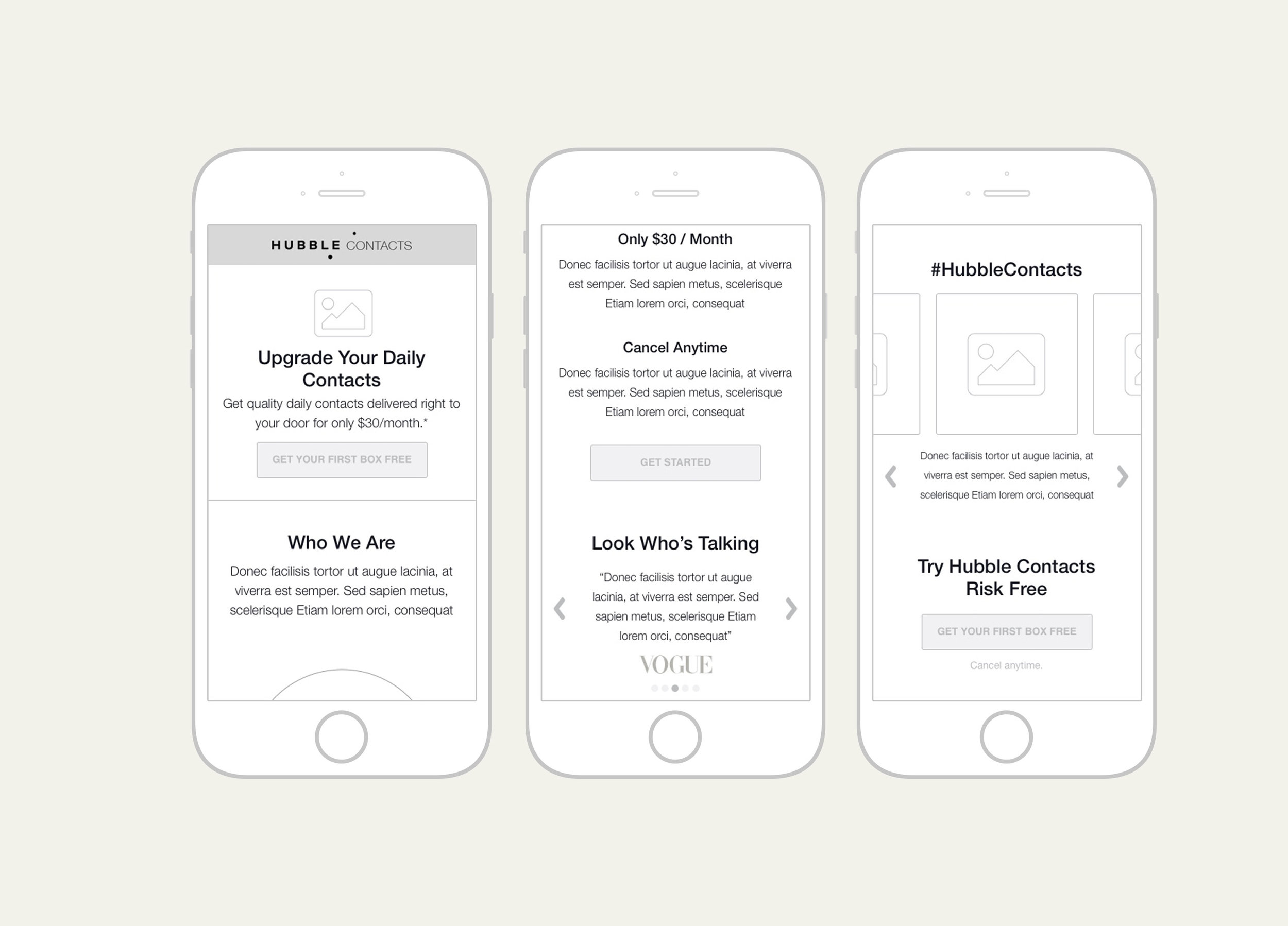
I started researching competitor landing pages and what kind of language they used in describing their subscription boxes. I also looking into how they designed their checkout flow. I then moved to brainstorming different headlines, sub-headlines, and CTA combinations to figure out the best way to clearly communicate the Hubble price value prop. Simply stating that it was $30/month did not seam convincing enough and users needed this broken down into more tangible language. We also developed an experience map for our users to help us better understand where the friction points may be, and how we could solve for them.
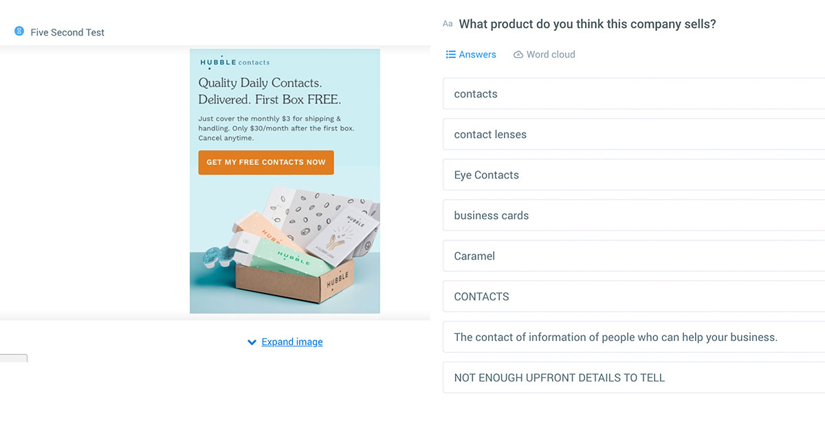
User Experience
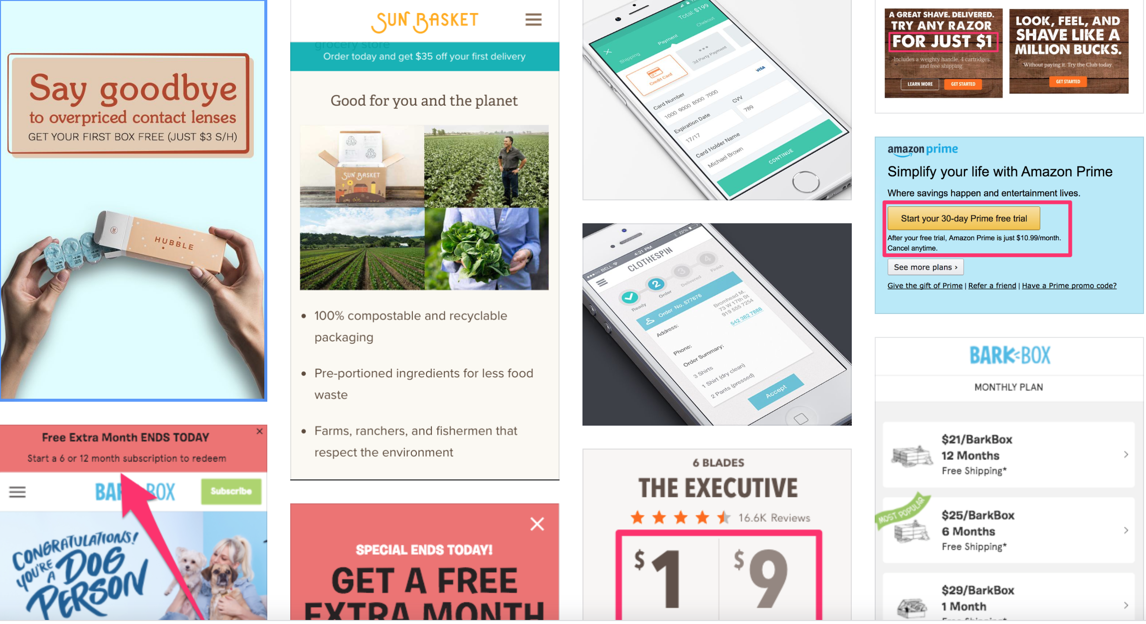
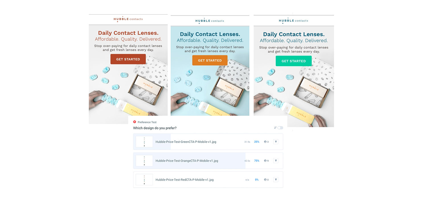
I decided that we needed to conduct some user testing on the page to get a better idea of what our visitors were actually thinking when coming to our landing page. I ran a few 5 second tests to see if our value prop was being communicated clearly to potential Hubble customers. One of the most interesting findings was that a large portion of users thought the site was for business cards! I quickly realized that because our headline only said “contacts” instead of “contact lenses” it wasn’t immediately clear what the product was. Also, it was hard to see the product exactly in the box. I ran a preference test to see what hero image our uses prefered and almost 100% prefered an overhead shot with hands to give more context of how large the product is. I also wanted to see which color scheme users prefered (either the original warm colors, complementary colors, or cool colors).
User Interface
I decided to change the color-scheme of the Hubble brand slightly to make the CTA stand out even more. I used a light blue background color to contrast with a bright orange color CTA button. Orange is usually associated with buying and subscribing so we thought this would be a good choice for Hubble. I kept the soft blue background color through out the checkout screens and used a what box to highlight where I wanted users to focus on (the form fields). I made the CTA button the full width of the form field white box. A majority of our visitors were coming on their mobile devices, so I decided to implemented minimizing form field headers to keep users from being overwhelmed with information.

Results
Version A nearly doubled the about of users getting to the next step in the funnel. However, Version B ended up having a slightly higher conversion rate. Our hypothesis is that visitors clicked through to see what the price would be for the product and dropped off at the end once they needed to input their credit card info.